
Graphic Content & Cyber Monday: the year’s deepest discount
Population booms and busts, milk drinking, Jewish origins, Germanic languages

Cyber Monday
Today only, lock in a $50 annual subscription rate to this Substack. The Cyber Monday price is the lowest the annual subscription goes and one of my only annual promotions.
Graphic Content
And now for some graphic content! My deep dives (for paying subscribers) often include startling data visualizations. Below are five particularly memorable graphic representations of findings I delved into on Substack over the past year of posts.

First, this figure from More than kin, less than kind: Jews and Palestinians as Canaanite cousins triggered heated debate both on the post and on social media. That might be because the bar plot is a genuinely apples-to-apples genetic comparison between Ashkenazim and various Middle Eastern groups, addressing the question of European Jews’ indigeneity. The qpAdmn framework generates the stacked ancestry percentages by testing the samples against a population tree of two closely related Middle Eastern populations (from the Megiddo site in Bronze-Age northern Israel and from Iran 6,000 years ago) and then successively against a European and African group. The ancestral European samples date from 5000-1500 BC (Europe_LNBA) and are diverse in geographical provenance, while modern Somalis are a stable mix of Eurasian and East African ancestry, and a valuable proxy population to capture potential signatures of Islamic-era slave admixture.
This plot underscores that no matter how you slice it, admixture models to explain Ashkenazi origins always find their ancestry to be a mixture of two components: a Middle Eastern population resembling Levantines and another that is European. No matter the exact values, which vary by model and ancestral population comparisons, this reality is always reiterated.

This world map scaled by relative birth rates from You can’t beat us if you join us illustrates that the future is already upon us. Now that the fertility crash has become a worldwide phenomenon, people are finally talking about total fertility rates, but both our short-term and long-term geopolitical realities are staring straight at us in this visualization. By the mid-21st century, raw population sizes will drive South Asian and African concerns to the fore, while by 2050, the working-age population of Nigeria alone will rival that of the entire EU.
Along these same lines, I also recommend Noah Smith’s post: Nobody knows how to stop humanity from shrinking.

This chart from Little Steppe earthquakes: upheavals both demographic and scholarly is a modified figure from The Genetic Origin of Indo-Europeans. The paper and my post get into the deeper origins of the Yamnaya people, the first Eurasian steppe nomads, prior to their push into Europe 5,000 years ago. We’re able to get back to the emergence of a pre-Yamnaya root stock by 4000 BC among the various peoples of the lower Volga basin. The team applied novel genomic methods to go beyond just genetic relationships in these ancient DNA samples, teasing out data on demographic dynamics from the individual samples: like effective breeding population size and rates of inbreeding. These methods can be invaluable in regions poor in both archaeological data and textual documentation.
The team concluded that around 3500 BC, one steppe group among the many, starting from a breeding population of just a few thousand, charted an expansionary explosion across the vast steppe that would see their population’s numbers skyrocket over the next millennium. This preliminary population boom perfectly sets us up for the expansion of the steppe ancestry signature we observe genetically all across Western Eurasia, in small bursts before 3500 BC and then in massive waves across Eastern Europe from 3000 BC onward.

In Got milk? Get -13910*T I shared a figure adapted from Large-scale migration into Britain during the Middle to Late Bronze Age showing just how ancient DNA has revolutionized our understanding of functional evolutionary genomics, even as it still challenges us with fresh historical and anthropological uncertainties. The figure clarifies that the mutation conferring lactase persistence in Europeans and South Asians (the hack that allows some subset of adult humans to digest dairy milk), at -13910*T, only increased recently in history. Most of the increase in frequency in continental Europe occurred between 500 BC and 1000 AD, while in Britain it was between 1500 BC and 500 AD.
We know from archaeology that agro-pastoralism became widespread in Europe around 3000 BC, and that ancient peoples consumed dairy in the form of cheese, so it’s intriguing that the adaptation for adults to digest milk sugar only seems to have become pressing later. This presents us with a tantalizing new mystery, and no model yet explains why the evolutionary dynamics would be different in Britain than the rest of Europe. The findings are also a vivid caution against thinking of evolution and selection pressures as obscure dynamics last observed in our distant past. Evolution continues apace to this day, and clearly drove observable change in our ancestors even very recently.
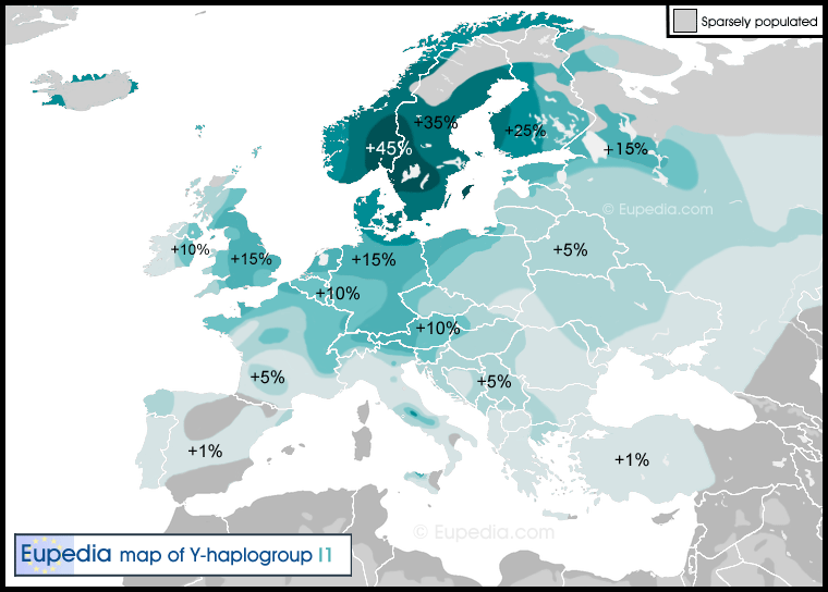
This map, adapted from Eupedia, appeared in The two Indo-European revolutions and Germania’s rise. It shows that the Y-chromosomal distribution of haplogroup I1 correlates strongly with European regions that today speak Germanic languages. This post went live shortly before several new preprints on ancient German genetics came out, but none of those overturned the overall picture I wrote about. It seems after the initial Indo-European-speaking Corded Ware and Bell Beaker cultures spread across the continent between 2900 and 2300 BC, subsequent late Bronze-Age population turnovers after 1800 BC determined the ethnographic distribution we see documented by classical authors. Though this is best seen in the ancient DNA work, even more old-fashioned Y-chromosomal haplogroup distributions like this can show us the way.